Social Media Image Sizes: A Practical Reference
Every social network crops, resizes and compresses images in its own way. Upload a photo at the wrong shape and the platform decides what gets cut off. That might be the top of someone's head, or the product you were trying to show. Upload it too small and it looks soft. Knowing the common sizes before you design saves a lot of re-exporting.
Below are the commonly recommended dimensions for the major platforms, grouped by network. One thing first:
These numbers change
Platforms update their layouts regularly. The sizes here are widely used recommendations, compiled when this guide was written, not official guarantees. Before a big campaign, check the platform's own help pages. Aspect ratio matters more than exact pixels: an image with the right shape and enough resolution will display well.
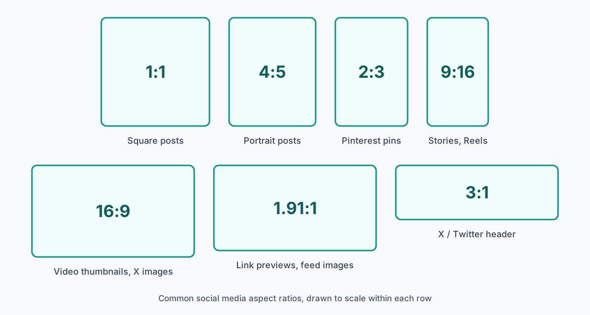
Aspect ratio vs. pixel size
Aspect ratio is the shape of an image: the relationship between its width and height. A 1080 × 1080 image and a 500 × 500 image are both 1:1. Pixel size is how much detail the image holds. Get the ratio right to control cropping, and use enough pixels so the image stays sharp on high-resolution screens.
When in doubt, upload at the recommended size or larger in the same ratio. Platforms scale images down more gracefully than they scale them up.
| Image | Size (px) | Ratio |
|---|---|---|
| Square post | 1080 × 1080 | 1:1 |
| Portrait post | 1080 × 1350 | 4:5 |
| Landscape post | 1080 × 566 | 1.91:1 |
| Stories | 1080 × 1920 | 9:16 |
| Reels | 1080 × 1920 | 9:16 |
| Profile picture | 320 × 320 | 1:1 |
Portrait posts take up more of the screen in the feed than square or landscape ones. Instagram's profile grid shows cropped previews of posts, so check how your image looks in the grid as well as in the feed.
| Image | Size (px) | Ratio |
|---|---|---|
| Feed / link image | 1200 × 630 | 1.91:1 |
| Cover photo | 1200 × 315 | about 3.8:1 |
| Profile picture | 170 × 170 | 1:1 |
| Event cover | 1920 × 1080 | 16:9 |
| Group cover | 1640 × 859 | about 1.91:1 |
| Stories | 1080 × 1920 | 9:16 |
Cover photos are cropped differently on computers and phones. Keep text and faces near the centre so nothing important is cut off on either.
X (Twitter)
| Image | Size (px) | Ratio |
|---|---|---|
| In-post image | 1200 × 675 | 16:9 |
| Header | 1500 × 500 | 3:1 |
| Profile picture | 400 × 400 | 1:1 |
| Link card image | 1200 × 628 | 1.91:1 |
The profile picture overlaps the bottom-left of the header, so avoid putting anything important there.
| Image | Size (px) | Ratio |
|---|---|---|
| Company page cover | 1192 × 220 | about 5.4:1 |
| Company logo | 300 × 300 | 1:1 |
| Profile picture | 400 × 400 | 1:1 |
| Post image | 1200 × 627 | 1.91:1 |
| Article cover | 1200 × 627 | 1.91:1 |
LinkedIn's cover images are very wide and shallow. A simple background with a small amount of text works better than a detailed photo.
TikTok
| Image | Size (px) | Ratio |
|---|---|---|
| Video / cover image | 1080 × 1920 | 9:16 |
| Profile picture | 200 × 200 | 1:1 |
Buttons, captions and the username overlay the right-hand side and the bottom of the screen. Keep text and faces in the upper middle.
| Image | Size (px) | Ratio |
|---|---|---|
| Standard pin | 1000 × 1500 | 2:3 |
| Square pin | 1000 × 1000 | 1:1 |
| Story pin | 1080 × 1920 | 9:16 |
| Profile picture | 165 × 165 | 1:1 |
YouTube
| Image | Size (px) | Ratio |
|---|---|---|
| Video thumbnail | 1280 × 720 | 16:9 |
| Channel banner | 2560 × 1440 | 16:9 |
| Profile picture | 800 × 800 | 1:1 |
| Video | 1920 × 1080 | 16:9 |
The channel banner is shown very differently on TVs, computers and phones. Only a narrow strip in the middle is visible everywhere, so keep your logo and text there.
Tips for sharp, well-framed social images
- Design for the crop. Keep faces, products and text in the centre of the frame, away from edges that may be cropped or covered by buttons.
- Don't stretch images. If a photo is the wrong shape, crop it or extend the background. Squashing it distorts faces and products.
- Pick the right file type. JPG is usually best for photos. PNG keeps text and graphics crisp, and it's the format you need for anything with transparency. See JPG vs PNG vs WebP for more detail.
- Check on a phone. Most people will see your image on a small screen. Text that's readable on a monitor can be too small on a phone.
- Keep a consistent look. The same fonts, colours and style across posts makes your content recognisable.
Using cut-outs in social graphics
Many social images are built from cut-outs. Think of a creator next to a headline on a YouTube thumbnail, or a product on a brand-coloured background in a story. Removing the background gives you a subject you can reposition for each aspect ratio without reshooting. Start with a transparent PNG from ClearCut, then build the layout in your design tool. Our article on ways to use transparent images has more ideas.
Useful tools
- Canva and Adobe Express: templates already sized for each platform.
- Figma: collaborative design with reusable frames for each size.
- Adobe Photoshop and Illustrator: detailed design work.
- TinyPNG and ClearCut's Image Compressor: make image files smaller before you upload them.
- Snapseed, VSCO and Lightroom Mobile: editing on your phone. See our mobile photo editing workflow.