How to Choose a Background Colour for Product Photos and Portraits
The background is the largest area in most product photos and portraits, so its colour changes the whole feel of the image. A white background feels clean and neutral. Black feels dramatic. A brand colour makes an image instantly recognisable as yours. Pick badly, and the background competes with the subject instead of supporting it.
Here's a practical way to choose, starting with the thing that matters most: contrast.
Start with contrast, then think about mood
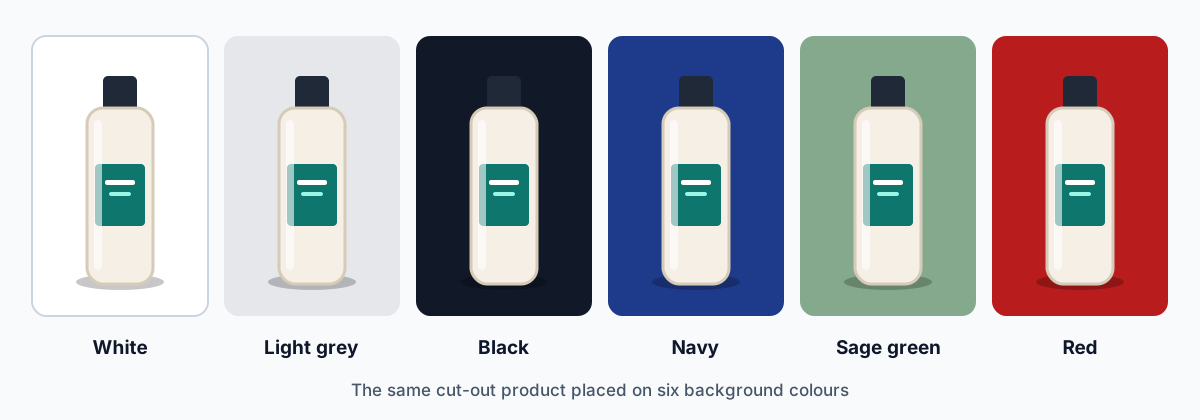
Before thinking about what a colour "means", check whether the subject stands out from it. Contrast is mostly about lightness. A light product needs a darker background, and a dark product needs a lighter one. In the illustration above, the cream bottle stands out well on every colour except white. Its black cap, meanwhile, all but vanishes against black.
A quick test: turn the image to black and white. If the subject still stands out clearly, the contrast is fine. If it melts into the background, pick a lighter or darker background.
What background colours tend to suggest
Colours carry associations, although they vary between cultures, industries and personal taste, so treat these as starting points rather than rules.
White
Clean, neutral, professional
Black
Elegant, dramatic, premium
Grey
Neutral, balanced, modern
Blue
Calm, trustworthy, stable
Green
Natural, fresh, balanced
Red
Energetic, urgent, bold
Choosing a colour for the job
White: for products and marketplaces
White is the default for e-commerce for good reason. It's neutral, it matches almost any website design, and some marketplaces require it for main product images. It also makes a catalog look consistent. The one weakness is white or very pale products, which need a subtle shadow or a light grey background to keep their edges visible.
Black and dark tones: for drama and premium products
Dark backgrounds suit jewellery, watches, perfume and anything with shine or light-coloured detail. They make highlights glow. They're less forgiving, though. Dark products lose their outline, and any halo left from background removal shows up clearly.
Neutral grey: the flexible middle ground
A mid or light grey works with most colour schemes and doesn't compete with the subject. It's popular for headshots because it flatters most skin tones. It's also a sensible choice for white products that disappear on pure white.
Brand and accent colours: for personality
A colour from your brand palette makes social posts, banners and team photos recognisable at a glance. Choose a shade with enough contrast against the subject. Muted or lighter versions of a brand colour often work better than the full-strength one.
Things to check before you decide
- The subject's own colours: choose a background that complements them rather than one that's nearly the same.
- Where the image will appear: a white product image looks lost on a white web page without a border or shadow, and a marketplace may require white anyway.
- Your brand: if you use images across a website and social media, a small set of approved background colours keeps everything consistent.
- Your audience: colour associations differ between regions and age groups. What reads as festive in one market can look out of place in another.
- Colour spill: when you shoot on a coloured backdrop, light bounces off it and tints the edges of the subject. Shooting on neutral and adding the colour digitally after removing the background avoids this.
Tip: use the colour wheel
Colours opposite each other on the colour wheel, like blue and orange, create strong contrast. Neighbouring colours, like blue and teal, feel calmer. Tools like Adobe Color show these relationships for any colour you pick.
Common mistakes
- Colours that fight each other: fully saturated opposites, such as bright red on bright green, can look like they're vibrating at the edges.
- Too little contrast: a beige bag on a cream background looks washed out, even if the colours go together.
- Changing colour every time: a random background for each post or product makes a feed or catalog look unplanned.
- Overcomplicating: gradients and patterns draw attention to themselves. When in doubt, go plainer.
How to try several colours quickly
The easiest way to decide is to see the options side by side, as in the illustration at the top of this article:
- Remove the background from your photo once, so you have a transparent PNG.
- Place it on a few coloured layers in Canva, Figma, Photoshop or any editor that supports layers.
- Compare them at the size people will actually see, whether that's a phone-sized thumbnail or a full product page.
- If you have enough traffic, test two versions against each other and see which gets more clicks or sales.
Palette tools such as Adobe Color, Coolors, Paletton and Color Hunt are useful for finding shades that sit well together.
If you're choosing backgrounds for a store, our product photo editing tips cover consistency across a catalog. For social media, the image size reference helps you plan the space around your subject.