How to Reduce Image File Size for Websites
Images are often the heaviest part of a web page. A single unoptimised photo can outweigh all of a page's text, code and styling put together. Reducing image file sizes is one of the most effective ways to make a website feel faster, and it doesn't require any special skills, just a sensible routine.
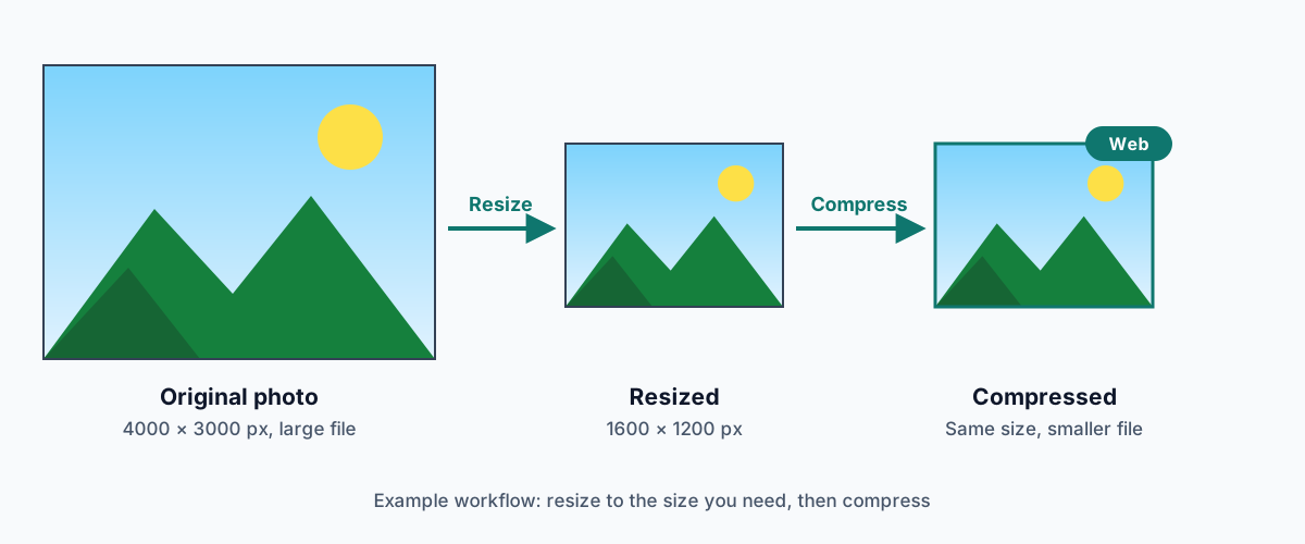
Why large images slow websites down
Every image on a page has to be downloaded before it can be shown. Larger files take longer, especially on mobile connections, and they use more of your visitors' data. Large images often matter most at the top of the page. Google's Core Web Vitals include Largest Contentful Paint, which measures how quickly the main content appears, and on many pages that's a hero image or product photo.
Oversized images also cost you: more storage, more bandwidth, and slower backups.
Choose the right format first
- Photos: WebP is usually the best choice for websites, and JPG is a safe alternative everywhere.
- Logos, icons and graphics with transparency: use PNG or WebP. Use SVG if you have a vector version.
- Screenshots with text: use PNG or WebP. JPG smudges text.
Not sure? See JPG vs PNG vs WebP. To switch an existing file, use the Image Converter.
Resizing vs compression
These are two different things, and you usually want both:
- Resizing changes the dimensions, meaning the number of pixels. A 4000-pixel-wide photo shown in an 800-pixel-wide column is sending five times the width, and around twenty-five times the pixels, that the space can show.
- Compression changes how efficiently those pixels are stored, without changing the dimensions.
Resize first, then compress. Removing pixels you don't need often saves more than any quality setting can.
How big should you go? A common approach is to export images at up to twice the width they're displayed at, so they stay sharp on high-density "retina" screens. A full-width hero image might need around 2000 to 2500 pixels, while a blog content column often needs far less.
Format-specific tips
JPG
A quality setting of around 70 to 85 is a reasonable starting range for website photos. Compare the result with the original and adjust from there.
WebP
Use lossy WebP for photos at a similar quality range, and it will often be smaller than the equivalent JPG. Use WebP with transparency for cut-outs and logos that would otherwise be large PNGs.
PNG
Keep PNG for graphics where exact pixels matter. For large photographic PNGs, such as transparent product cut-outs, converting to WebP is usually the biggest win. Re-saving a PNG as PNG won't reliably make it smaller.
Quality settings in practice
There's no universal "best" setting. A busy, detailed photo can hide compression well, while a smooth gradient shows it quickly. Rather than picking one number for everything, test a few typical images from your site. Find the lowest setting that still looks right at the displayed size, and use that as your default.
By type of site content
E-commerce product images
Product images need to look sharp, often with zoom, so don't compress them too aggressively. Keep them large enough for your store's zoom feature, and use a consistent size and background. Compress thumbnails and category images harder, since they're shown small. Our product photo editing tips go into more detail.
Blog images
Resize to your content column width (or double it for sharp screens), save photos as WebP or JPG, and add descriptive alt text. Use lazy loading for images further down the page, so they only load when readers scroll to them.
Social media images
For images you post to social networks, upload good-quality files at each platform's recommended size and let the platform do its own compression. Our social media image size reference lists the common dimensions. The social preview image for your own pages (the og:image) should also be reasonably sized, so link previews load quickly.
Don't forget mobile visitors
Many visitors will see your site on a phone, sometimes on a slow or metered connection. Phones don't need desktop-sized images. If your website platform supports responsive images, using srcset in HTML or the platform's built-in image sizes, let it serve smaller versions to smaller screens.
A practical workflow
- Keep your originals in a separate folder. Never overwrite them.
- Decide the display size for each image and resize to it, or to twice it for sharp screens.
- Pick the format: WebP or JPG for photos, PNG or WebP for graphics and transparency.
- Compress starting around 75% quality, and compare with the original.
- Check the file size. If a result isn't meaningfully smaller, keep the original.
- Name files descriptively (for example
blue-ceramic-mug.webp) and add alt text when you upload. - Test the page on a phone to make sure images still look sharp.
The Image Compressor handles steps 2 to 5 in one place. You can set a maximum size, choose JPG or WebP, adjust the quality and compare sizes, and it all runs in your browser. For the reasoning behind the settings, read how to compress an image without losing too much quality.